When can we have smarter layout?
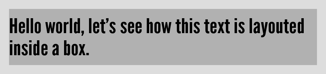
So, what are our options?
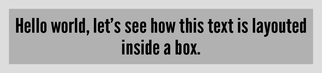
Hmm, I still feel we can do better, what about this last option…

Ok, definitely no cigar…
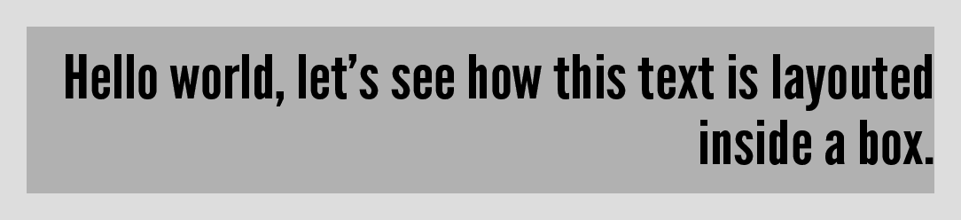
I don’t know about you, but I’d prefer something more like this:

Conceptually, it’s about maximizing margins and minimizing the distance your eyes need to move to read the text. I‘d also argue that this is the only one that makes any aesthetic sense of the examples above.
The design of our creative tools and the web have improved a lot during the last 15 years, we now got great typography, displays that are crisp as paper and a widely spread overall design focus and knowledge. Why is it that we still accept things like our titles getting uglily cut off with only the last word on its own line?
It’s not just about text
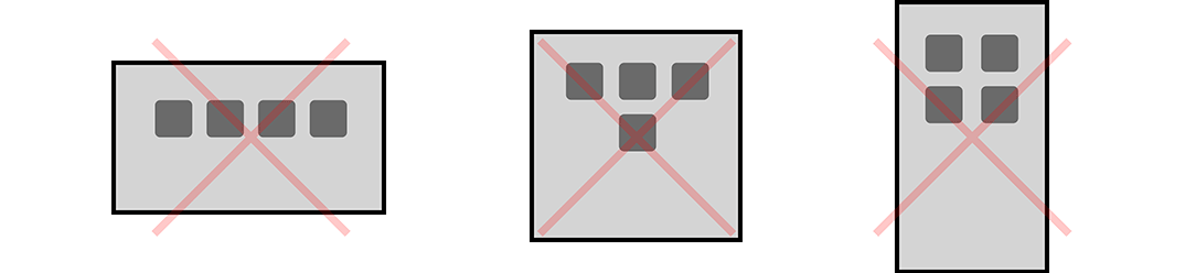
Let’s say you have an app (or starting page) with 4 big icon buttons. What if you could get nice dynamic layout, automatically, by just letting them flow:
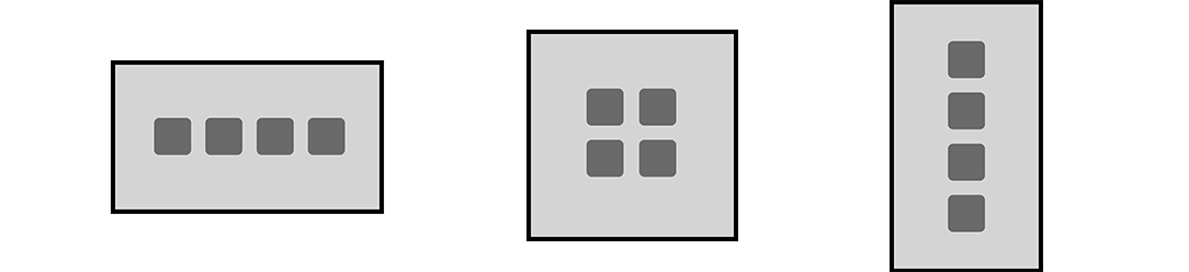
No need to worry about cases like:
How then?
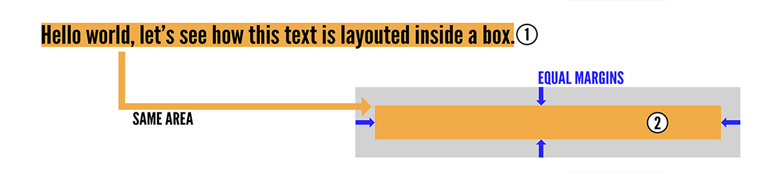
Get the total area of the content as a single row.
Find the rectangle that, with the the given area,
have the same margins on all sides.
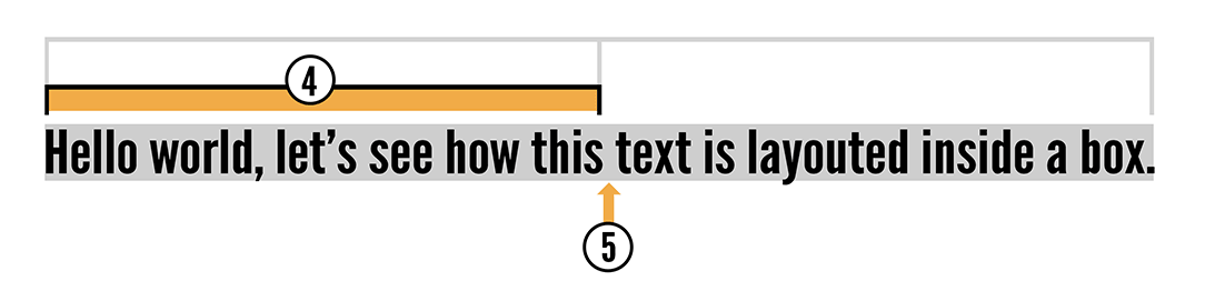
Estimate the number of rows needed.
(rectangle height / single row height, rounded upwards)Find target width. (content width / row count)
Split content into rows that are as close to target width as possible.
Center horizontally and vertically.
Step 5 is the hard part since the math assumes that the row of content can be split at any point, but the words very often overlap the ideal split points. This part of the problem is similar to what conventional justified-text-layouting also needs to do (or at least should do), minimize raggedness.
Proof of concept hack
You can interactively try it out here in Mad Tea Lab, or just check the video:
Ending notes
This has been annoying me for some years now and I thought it was time to share the joy! The described algorithm is more of an example rather than a final fix. I don’t think I am the only one thinking along these lines, I’d guess there are both obscure and and high end commercial software out there with interesting layouting implementations! So let me know if any comes to your mind as you are reading this!
Edit 2017–11–19:
I have found a nice solution in the draft CSS Text Module Level 4, there is also a working polyfill called balance-text. The polyfill isn’t perfect since it will first layout in the default way, and then the js code will kick in and do the balanced layout (that’s actually how I found out about it), but a lot of web pages could look better if this was used more!